How do you read an article in the newspaper?
You start with the headline that screamed at you from the newsstand. Then you read the sub-headline, which is printed in smaller font size. Next, you proceed to read the body copy.
Why do you read in this order? You read the headline first because its large, bold font grabs your eyeballs as soon as you glance at the newspaper. Next, the sub-headline catches your attention. You are compelled to read in this order because of the way the text is presented.
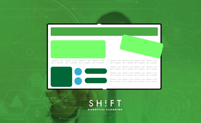
This is visual hierarchy, where information is ordered based on its importance and visually presented using contrasting forms to influence the viewing order.
The concept of visual hierarchy is rooted in the Gestalt theory of perception. According to this theory, the human brain is wired to make sense of the world by ordering and structuring diverse elements into an organized, logical whole.
As an eLearning designer, you should keep visual hierarchy in mind when designing your courses. Here’s why:
- It categorizes and prioritizes information. You want your learners to notice the most critical piece of content first and then read through the others in the order of their importance.
- It creates a flow to guide learners through the content. When you establish a strong visual hierarchy, learners can move through the content on a screen smoothly without any frustrations.
- It creates order out of chaos and imparts balance. If you don’t establish a clear visual hierarchy, every piece of content will either scream for attention or will fade into the background. This is a chaotic and cluttered situation and confuses the learner who cannot make out what to read first because everything or nothing seems important.
- It creates a point of interest that attracts learners. A strong visual hierarchy established by using contrasting forms creates a focal point of interest. Such screens are more attractive than the ones where every piece of content is, say highlighted, or the whole text is presented in a single chunk. Screens with no visual hierarchy give the impression that no piece of content is significant enough to be paid attention to.
Read more: Dear eLearning Designers, Please Stick To These Basic Design Principles
There are quite a few ways to create visual hierarchy and impart a sense of structure to a screen. Here they are:
Tool #1: Typography
This is the easiest way to establish hierarchy. Think of the newspaper or a magazine. The typographic hierarchy established here compels you to read the headline in the large font first and then the body text, which is printed in a smaller-sized font. If the text had not been presented in this way, you would be at a loss trying to figure out which is the most important piece of content and where to start reading from. There would be no start point and no way to figure out what to read next.
Here are some pointers to help you create typographic hierarchy:
- There is a positive correction between the size of the text and its importance. Use large font sizes to differentiate important and noteworthy pieces of content from the rest of the text because the eye naturally rests on the biggest visual element on the screen and then moves on to the next largest element and so.
- A headline in a large size and especially if it is placed in the upper left corner of the screen draws attention to it first. Here’s more on how placement impacts hierarchy.
- Consider using variants of typefaces of the same family, or bold or italics, to distinguish between titles, sub-titles, and paragraphs.
- Make sure that the headline resembles a headline, and the body text looks like it is the body text. Follow the three levels of typography hierarchy to design.
- Watch out. Using too many font sizes and typeface variants on a single screen can create chaos and confuse the learner who can’t figure out where to rest his gaze because now too many things stand out.
Read more: 5 Methods to Achieve Visual Consistency in eLearning
Tool #2: Grouping and Alignment
The relative importance of the elements on the screen is implied by the way they are grouped together.
Grouping and alignment help create a visual flow that guides the learner from one piece of content to the next in their most logical sequence. Grouping similar elements and nestling them inside sub-groups aids comprehension, retention, and recall.
As an eLearning designer, you should create distinct subcategories or sub-hierarchies to structure the elements on screen. Else, your learners will create the categories themselves and in a way that might not help the learning process.
Here are some pointers to help you group, align, and position elements on the screen to improve learnability:
-
Proximity determines hierarchy. Use bulleted lists to club content connected to each other. For instance, create separate lists for the features of a product and the disadvantages of using it. A list can also show the relationship between various items with indented entries on the list implying sub-categories.
-
Don’t neglect the power of white space in establishing hierarchy. Paragraphs should be separated from one another by a patch of white. Within a single paragraph, title, sub-title, and body content, all separated by white space, suggest a different hierarchy.
- Isolate the different groups to emphasize their distinction. You can use white space to separate the groups or space them across multiple slides.
- Sort your information into categories to draw your learner's to the most important information and help them flow down through the supporting and least important information.
Here are some more ideas on how to create a visual flow between the similar and dissimilar elements on the screen.
Read more: Powerful Psychological Strategies for Use in Graphic Design
Tool #3: Image Size
You just cannot notice an image on a page that is full of text. Think of a greeting card. We are usually swayed by the image before we pick it up from the shelf and read the message. It is the designer’s idea to move us with an evocative image, so he placed it in front of the card. Or think of how some news items consist of just one large photograph accompanied by a teeny-tiny bit of text. These are usually news of extraordinary events where the photographs—high-resolution, large, and detailed—depict the reality most accurately and thus create the greatest impact.
Keep the following tips in mind while adding images into your eLearning courses:
- Images that take up the most space on the screen or are brighter and in sharp contrast to other elements catch attention readily. Make sure you choose high-quality images to represent information that you want to get noticed first.
- Attractive images create a focal point of interest and arrest the attention. Make sure that you represent with large or high-resolution images that content that you want the learners to ponder over.
- An image placed in the middle of a block of text or the screen is more attractive than the text. And because the learner’s eye is already resting on the image, it is important to use this opportunity to place a caption under every image. It is more likely to be read when placed in this position than when it is placed anywhere else. Use the caption to reinforce the most important piece of information and redirect the learner’s attention to the body text.
Tool #4: Color
Colors can create visual hierarchy easily. Place a patch of color behind a chunk of text, and it immediately stands out on the page. Write a word or a phrase in a different color from the rest of the text and it immediately pops up on the page. A colored photograph catches the eye readily in the midst of a group of black-and-white images or vice versa.
Here are some pointers to help you establish visual hierarchy with color in your eLearning courses:
- Use color to differentiate between sub-hierarchies.
- Use contrasting but complementary colors on the same screen to highlight some elements. Here’s a color wheel to help to choose complementary colors.
- Some colors are more attractive than others. For instance, black and red catch the eye more readily than lilac or a light shade of blue. So do high-contrast colors and colors of different temperatures paired against one another. Here are some more tips on how to work with color to create hierarchy.
- If you want to draw the attention of the learner to a specific piece of content on the screen, use the element of surprise. Grab learner attention by changing the color of the text dramatically. The learners will be compelled to pay attention to this part of the screen because the elements here deviate significantly from the standard design.
- Ensure that your screen does not end up looking like a colorful “mess” where there are too many colors and the overall effect is jarring. Use a sober color palette, and reserve the brightest and boldest colors for the most critical piece of content.
Read more: 9-Point Checklist for the Perfect eLearning Course Design
Final Tip
After you have moved around the elements, added a spot of color here, increased the white space there, and played around with text sizes, it is time to check if you have succeeded in establishing the visual hierarchy that you want learners to see on screen. Lee Munroe, a designer at Rackspace, suggests the Blurring Technique.
Move away from the computer, squint your eyes, and stare at the screen for some time till it becomes a blur. Or take a screenshot and add a 5-10 pixels Gaussian Blue on Photoshop to get the same effect, minus the strain on your eyes. Notice which elements stand out. If these are not what you want your learners to focus on immediately after landing on the page, then you have to rethink and redesign.
REFERENCES:
6 principles of visual hierarchy for designers. https://99designs.com/blog/tips/6-principles-of-visual-hierarchy/
The Design School Guide To Visual Hierarchy https://designschool.canva.com/blog/visual-hierarchy/
Creating Visual Hierarchy With Typography https://designshack.net/articles/typography/creating-visual-hierarchy-with-typography/
The Principles of Graphic Design: How to use Hierarchy and Emphasis Effectively. http://www.edgee.net/the-principles-of-graphic-design-how-to-use-hierarchy-and-emphasis-effectively/
The 5 pillars of visual hierarchy in Web design http://thenextweb.com/dd/2015/04/30/the-5-pillars-of-visual-hierarchy-in-web-design/#gref
Designing Interfaces Published by O'Reilly Media, Inc.