Like the King of Pop once sang “it doesn’t matter if its black or white…as long as you use good, complementary choices from the color wheel.” Ok, maybe those weren’t the exact lyrics, but the point is that color, regarding its place in eLearning design, is quite significant and knowing how to use it can make or break your eLearning courses.
How do you decide what colors go where and how? The answer can be found in the spinning wonder we know as The Color Wheel. That spiffy, rainbow-hued circle you were likely introduced to all the way back in elementary school is actually an extremely useful tool for creating seamless, organized designs.

The Color Wheel
The color wheel is a circular diagram that shows how colors are related to each other based on the primary colors of red, yellow and blue. These colors and their offspring (the secondary and tertiary colors) live on a spectrum that creates a kind of family tree for all the pigments we know and love.
See this short video for a simple and clear explanation.
Basic Color Wheel Components
In simple terms, the color wheel consists of:
- Primary colors: Red, yellow and blue.
- Secondary colors: Orange (a mix of red and yellow), Green (blue+yellow), and purple (red+blue).
- Tertiary colors: These colors come about when a primary color is mixed with a secondary color. For example blue mixed with green gives us blue-green, a color most would classify as “green” but having a more blue tinge.
While it’s common for eLearning designers to know what works together intuitively, it is more effective and consistent if you know why you’re picking the colors you’re picking. Because of this, it’s a fantastically good idea to have a knowledge base in color theory. That's why you should understand some available "formulas" for determining color schemes.
Formulas for Choosing Color Schemes
Colors that are grouped together are known as a scheme, and these hues are picked based on certain theories of what visually works and what doesn’t work. While the rules may be made to be broken, you have to know the rules before you can tinker with them successfully. When choosing a scheme, keep one or more of these theories in mind to help your colors sing harmoniously.
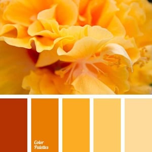
1) Monochrome: It's all the same to me
A monochrome color scheme is pretty much the most basic and safest color scheme. This theory on color grouping is based on taking a single color such as yellow and creating tints (made by adding white to the original color) and shades (made by adding black to the original color) of that color. Saturation can also be a consideration in this theme and is a bit trickier to understand. Instead of being about light or dark, saturation is about intensity (pale to strong) and how far away from true gray the color is.
See this example:
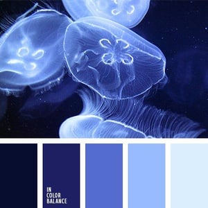
Uses: Monochrome schemes look clean and seamless and can create a strong connection to a single idea or brand identity on your slide.
Downside and How to Fix it: When only working with one color, the most obvious problem can be that there simply isn’t enough contrast to draw interest and the design can get boring fast. Pure black or white can be paired with the main color to bring emphasis where needed. See these examples to understand how you can do this.
Also read: 6 Ways Color Psychology Can Be Used to Design Effective eLearning
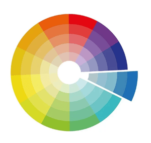
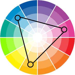
2) Opposites: Do they really attract?
Yes, opposite colors really do attract and unlike a couple who has nothing in common, opposite colors have a far better chance of making things work long term. The theory of color opposites is based on the idea that a color sitting on one side of the wheel is going to create visual interest when paired with the color directly opposite it on the color wheel.
An alternate name for this scheme is ‘complementary color scheme’ and you can think of it as one color making up for what the other color lacks because they complement each other.
See this example:
 .
. 
Uses: Because of the opposition, this scheme creates a highly contrasted and vivid effect that is awesome for an energetic presentation. eLearning designers will often use the main color for the background of a slide and use the opposite color to highlight certain areas such as clickable elements or important messages.
Downside and How to Fix it: These combinations can sometimes be a little too loud and jarring for some designs. To mitigate this, try combining colors that are a tint or shade of the original colors.
Near-Complementary Colors: Another way to keep much of the same vibrant contrast but without things getting garish or overly dissonant is to choose near complementary colors. These are colors that are not quite opposite each other, but instead are a color that is next to the opposite. For example, instead of pairing red and green you can pair red and blue, or green and orange. Think about those examples and you’ll likely be able to envision many things that use those color combinations.
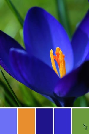
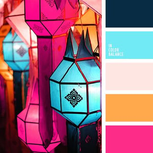
3) Analogous colors: The color next door
Analogous colors are kind of like when the boy and girl next door get together. They are colors that live alongside each other, so there is some contrast but not the kind of extreme difference that comes with colors living on opposite sides of the country.
See this example:
Uses: Because of their similarities these colors look so balanced and evenly matched they’re not just a boy and girl next door, they’re also the football captain and head cheerleader dancing at prom. They blend well and have all the same friends and can totally hang out on a page and look positively seamless.
To use this scheme properly, choose a dominant color such as red, a supporting color like red-orange and a third like red-violet who will act as the quirky sidekick who provides short, well-timed jokes or accents.
Downside and How to Fix it: Analogous color schemes have a similar problem to monochrome schemes in that they can get boring because there is too much similarity. To break this up, choose colors that aren’t too similar. The more tiers and complexity your color wheel has, the more chance you have of picking colors that are a little too close to each other, so it’s often best to pick from a more basic 12 step wheel. You can also use a fourth analogous color, creating more of a difference between the first and last choices. White and black accents can also be used.
Also read: 6 Essential Graphic Design Principles to Guide Your eLearning Course Design
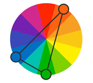
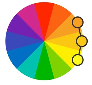
4) Triadic: They come in threes
Triadic color schemes come about when the prom queen falls for the quirky sidekick while still dating the captain of the football team, forming a love triangle that pushes them all further and further apart on the color wheel.
Ok, not really, but it is about three colors that are evenly spaced on a color wheel which is pretty much the same thing. More specifically, in a 12 step color wheel, this means three colors that are 120 degrees apart from each other, their points forming an equilateral triangle.
Uses: This uniform distance creates a balance of harmony and contrast that is best used by choosing a dominant color and utilizing the other two as accents. Even using pale or tinted versions of these schemes will still provide quite a bit of visual interest.
Downside and How to Fix It: There really isn’t much of a downside to a triadic color scheme though you still need to make sure that your colors aren’t competing with each other in an unappealing way. If you want a softer look to your overall design, using less saturated colors is the way to go.
While designing, keep these theories and your color wheel in mind to help you focus. Having a starting point such as a single color scheme can help you make good, practical design decisions when creating your courses and reduce the amount of time you spend trying to figure out the intangible “there’s just something that doesn’t look right on this page” problem. As you use the schemes, you’ll learn what works for your aesthetic and what doesn’t and how to incorporate even more complex colors so you can not only be the designer who makes it work but knows how to do it consistently.
Read more on Color Psychology and eLearning:
- Color Psychology: Use Warm Hues to Energize Your eLearning
- Color Psychology: Use Cool Colors to Set Just the Right Mood for Learning
- The Psychology of Color: How Do Colors Influence Learning?
REFERENCES:
Basics Behind Color Theory for Web Designer. http://www.hongkiat.com/blog/basics-behind-color-theory-for-web-designer/
Beginners Guide to Using the Power of Color in Web Design. http://speckyboy.com/2010/05/19/beginners-guide-to-using-the-power-of-color-in-web-design/