Recently, we found some powerful words by Carrie Cousins which made us think on how they apply to eLearning: "Design for readability or don’t bother using text at all. If you want your content to be effective, it must be readable."
As a learning professional, your responsibility is not just to deliver eLearning content to your students – it’s to make sure that it’s engaging and readable. What that means, is that you’re going to have to learn about design, especially typography.
At its essence, eLearning is mostly about reading, and if what you’re offering is visually confusing or hard to read, your then your material simply fails to deliver. And since readability is an essential aspect of comprehension, it's necessary to consider the ease with which students can read the text.
What Makes People Want to Read?
According to Nectafy.com, if you’re concerned that people might not be reading your content, chances are they aren’t. Or at the very least, they’re having a difficult time of it. When eLearning is your design focus, the last thing you want is to deliver content that isn’t readable. A good course is not made from stock photos and fancy fonts. What you want is letters that are easily distinguishable and illustrations that are interesting and relevant.
Illustrations will be the subject of another post. For now, we’re going to focus on type, and only type, and how it can help you develop an effective eLearning course.
So, back to the question. What makes people want to read? It’s letters that are obvious and clear. And reading online is very different from reading on paper. Why? Let’s talk about serif versus sans serif.
Pick easy-to-read fonts
Pick up a book, and chances are that what you’ll see within its pages is what’s known as serif type. Serifs are those tiny ornamental elements that finish off a letter. You’ll see them on typefaces like Times New Roman, Garamond, Palatino and Bookman, to name a few of the more popular fonts. On paper, serif typefaces are the easiest to read. On a computer screen, not so much.
So what fonts work best for on-screen reading? Ideally, your eLearning design will consist of sans serif typefaces like Helvetica and Arial. On screen, they’re clean and easy to read, where serif typefaces tend to blur.
Why is this so important? It’s simple – if your typeface is hard to read, then people aren’t really reading – they’re just skimming.
How to Design eLearning for Readability
It might be tempting to throw up your hands and say “I’m a trainer, not a designer!” But the fact is that as a learning and development professional, it’s your responsibility to ensure that your students absorb the material you’re delivering. So yes, you do have to be a designer – or at least understand the basics of design.
Strategies to Improve Readability
In order to deliver content that your students are actually going to read, there are a number of strategies you can employ. Here we offer you a quick course:
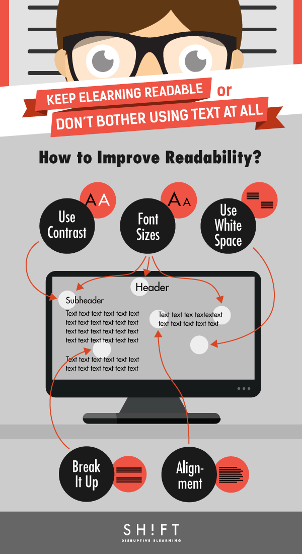
1) Use Contrast
The most readable text is simple – it’s black text on a white background. Please resist the temptation to use white text on a black background – it’s visually impressive, but no one is going to read it. And just because you can offer up text in blue, pink, green, or practically any other color of the rainbow, that doesn’t mean that you should. Different colors are great for headings and subheadings – they definitely attract interest and help the flow, but they’re not suitable for body text. Don’t try to re-invent the wheel. Black on white has worked for centuries as body text, and with good reason.
2) Break It Up
Any huge block of text is difficult to read. Morkes and Nielsen (1997) study revealed that writings for the Web scored 47% higher in usability when written to be more scannable. So mix it up with headers, sub-headers and bullet points to create an easy flow through your content. Simply stated, text is easiest to read when you deliver it in short paragraphs – ideally, no more than four sentences each. You can also toss in a graphic or two to add visual interest, but make sure that it relates to the content.
3) Use White Space
If your eLearning design consists of wall-to-wall text, no one is going to want to read. Use margins around your text blocks, and additional spacing between lines so that people know where one paragraph ends and the next begins.
Read further on how to use white space to improve your course’s legibility, readability, comprehension and usability.
4) Alignment
Type that is left-aligned is easier to read than type that is right-aligned. You can use right alignment occasionally, like when you’re wrapping text around photos, but in general, lean to the left. Justified type (that’s type that’s lined up equally on the left and the right) doesn’t work well on web pages, because the text blocks are usually narrow and justification results in huge gutters of white space.
5) Use Font Sizes Judiciously
Your body text should always be in one size, and one size only. Go larger on subheads, and larger still in headers. This alerts the learner to when a new topic or subtopic is being developed. Ideal sizes for effective eLearning courses are 18 point for headers, 14 for subheads, and 11 or 12 for body text.
There you go. Now you’re not just an trainer, you’re on your way to becoming a designer. Isn’t designing effective eLearning courses a lot easier than you thought?