As our world becomes more media-oriented, it grows increasingly clear that people show a preference for visual information over text. Graphs, diagrams, and other formats are more accessible than a block of text. However, poorly-presented data can do more harm than good. So, when using any of these visualization methods for eLearning, make sure they:
- are clear and coherent;
- aren't redundant
- add value to learning;
- aid retention and recall;
- and, of course, are within the scope of your budget.
To get started, here are four main types you can use.
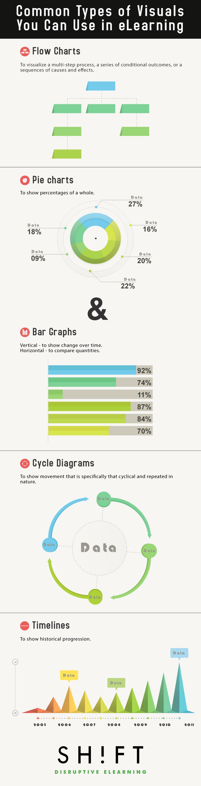
Flow charts (or flow diagrams) are graphics that represent a series of steps or processes. They are especially useful to visualize a multi-step process, a series of conditional outcomes, or a sequences of causes and effects. Flow charts work as visualization techniques for eLearning because they provide the learner with a visual relationship that's easier to remember than text.
Some examples of ideal flowchart situations include describing a process, walking someone through technical troubleshooting, and depicting a series of connected historical events.
In eLearning, you have options beyond just presenting the complete flowchart at once. Try making it interactive: have the next steps only be revealed once the learner has walked through the previous decision points, or present them with a desired outcome and allow them to experiment themselves with the choices needed to get there.
Flow charts are very simple to create. If the eLearning software you are using doesn't have an easy method already, use these tools:
When presenting data references to your students, it's a good idea to use graphs and charts. They convey the quantitative relationship in a different way, suiting learners who do not connect as well to written numbers. They also make content easier to read and help make the relationships between the data easier to comprehend.
Not all charts suit all data, however. Here are some basic guidelines:
- Pie charts show percentages of a whole - how much government spending went to each department last year, for example.
- Vertical bar charts are good for showing change over time - total spending over each of the last ten years.
- Horizontal bar charts are most useful for comparing quantities - the government spending as dollars rather than percentages.
In all cases, be careful not to add so much detail the graph becomes confusing. Label clearly, and remember that when categories get irrelevantly small, you can group them into one "Other" category to keep things clear.
Useful resources:
Slideshare: Data Visualization Technique - How to Design Charts and Graphs
Why Most People's Charts and Graphs Look Like Crap
Cycle diagrams are similar to flow charts, but they show movement specifically that is cyclical and repeated in nature. Many processes, from the carbon cycle in nature to the flow of money in the economy, fit this pattern.
As with flow charts, use these diagrams to demonstrate cause and effect relationships and explain how the cycle is self-perpetuating. And as with other charts and graphs, keep to the essentials and avoid overloading on detail.
Useful resources:
Here are 10 simple rules to help you convey your data more effectively.
How to make Awesome Diagrams for your Slides
As eLearning professionals, we can effectively use different data visualization methods to complement the training content. All too often, students encounter history piecemeal, outside of context, which makes it more difficult to connect individual events to larger movements and themes. Data alone is powerful, but wrapped with a good visual story, (like a timeline) will make it hard for learners to forget.
Using timelines provides a structure in which to show historical progression. With eLearning, these can even be interactive, whether as an activity to place items on the timeline or with information appearing when an event is clicked. A few other suggestions: placing the timeline on a map can show the relation between events, places, and times; for events within the student's lifetime, consider creating parallel timelines with their life events on one side and world events on the other.
Useful resources:
The Art Of Timelines For Learning by Connie Malamed
10 Creative Ways to Use Free Timeline Makers in eLearning
REFERENCES:
Writing for Success, v.1.0 by Scott Mc Lean
Using Visuals To Make Information Come Alive By Roger C. Parker