eLearning courses are designed to provide students with helpful information and not to bombard them with irrelevant and unnecessary pieces of content.
What many eLearning designers don't realize is that if they exceed a human’s brain capacity to understand and retain information, then all the effort spent creating the course goes to waste.
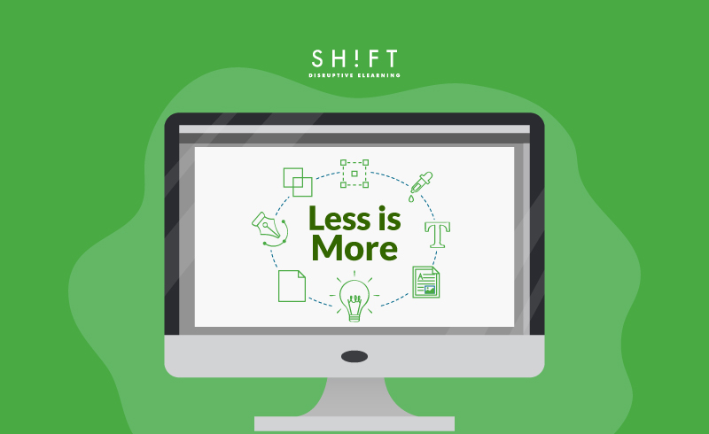
Designers are often asking us how they can improve the quality of their eLearning courses and make them more engaging. Our answer: Stick to one of design's timeless rules: “keep it simple.”
Applying the principle of simplicity in eLearning means conveying information in the simplest way possible. Less information will always be more. When too much clutter vies for the learner's attention, the learner may not see the forest for the trees. They end up thinking the course isn't worth so much effort, and the content gets lost.
However, keeping it simple can be an art. So, let’s discuss some tips to improve your eLearning design and help learners get through the course as fast as possible.
1) Know your audience
The importance of understanding the target audience cannot be stressed enough. The more you keep the audience in mind while you design the course, the more focused and relevant your content is going to be. After all, only an economist would be able to understand a fellow economist when he talks about the falling economy and is using complex economic jargons.
So, identify your learners, what they need to know, do, and feel before going starting with the design.
Read more: These 27 Questions Will Help You (Really) Know Your Learners
2) Focus on the essentials
Remember what Dieter Rams said? "Good Design Is as Little Design as Possible."
This is perhaps the most valuable piece of advice for any course designer.
If you think that you can take your old PowerPoint presentation, dump it into an eLearning format, and have high completion and satisfaction rates, then you are sadly mistaken. Modern learners expect A LOT more than an online version of the same old PowerPoint that they have seen before.
Successfully moving existing training content to fit the eLearning model requires streamlining your content and including only the most essential aspects of the course. Adhering to this rule of simplicity ensures that learners only receive as much material as they can absorb.
Resist including every detail in the course and sieve out ONLY the most relevant content! Here're two useful tips to achieve this:
#1) Follow the I.B.I Rule This is the golden rule of eLearning. I.B.I. means "interesting but irrelevant," and you are supposed to apply this rule to every piece of text and image you use on screen. An analogy may seem interesting to read, but if it does not enhance understanding, out it goes.
#2) Ask the right questions to your SME - this will help you focus on what's important and leave out the "nice-to-have" information.
3) Use white space
When you design your eLearning courses, are you aware of the amount of white space you use, and the effects it has on the learning experience?
You should!
People actually tend to ignore cluttered design. They gravitate, instead, to one that’s aesthetically pleasing. With 94% of people saying first impressions are design-related, make sure every screen is eye-catching and uncluttered. Embrace white space by ensuring that there is enough white (or blank) space in every screen so they don’t look too crowded.
When white space or negative space is used appropriately, it amplifies the focus of the content and makes it easier to read for your learners. It seems far more attractive than a cluttered screen full of information. Just think about it. When there is so much to take in, learners feel overwhelmed, and they end dropping the course or moving on to the next screen.
Here are a few examples of websites which make good use of white space.
And, here are other 21 Inspiring Examples of White Space in Web Design.
Also read:
How To Avoid Designing Cluttered eLearning Screens
The Power of White Space to Improve Screen Design in eLearning
4) Support text with visuals
Could you say it with a picture?
If your content can be better explained in a visual manner, eliminate the text, and transform it into a visual. And it doesn't necessarily need to be an image only! Get creative and experiment with other formats like infographics and video. These are all ways to condense what would be a lot of long, boring text into something that feels manageable and engaging to the learner.
There are plenty of words to describe or explain something, but as they say, ‘a picture is worth a thousand words’, images can save a lot of space you may spend on writing.
5) Avoid wordiness
You should try to express meaning in as few words as possible. In fact, studies reveal that lessons with the fewest words result in the most learning.
Here are some tips to avoid wordiness:
- Limit paragraphs to no more than three or four sentences spanning over two to three lines. This will avoid having too many ideas in a short space, will enable learners to digest information faster, and encourage learners to read more.
- Make sure there’s only one concept on every screen. This cuts down on distractions that detract from learning the main objectives.
- Use simple language. Try to translate all the information you want to convey in simpler terms. This does not mean that you are “dumbing down” your course. You are simply making it easier to understand, and, in the process, more interesting for those willing to pay for your course.
- Swap nouns for verbs. For example, "The yoga teacher gave a suggestion for modifying the pose" can be changed to "The Yoga Teacher suggested modifying the pose."
Read more: 7 Techniques for Reducing Wordiness in Your eLearning Courses
6) Think Micro
Gone are the days when students will sit for hours on end listening passively to training sessions. Today, people learn non-linearly and actively, on the go, in short bursts when they can find the time, and across a variety of devices.
Micolearning’s quick format allows learners to take advantage of short breaks throughout their day instead of interrupting it for long hours at a time. They can focus on something for 5-15 minutes and then move on to more critical issues. It’s more realistic to request the completion of a bite-sized 10-minute lesson per week then a 3-hour course from your employees.
Read more:
Maximize Student Learning Time and Efficiency in eLearning Environments
So, these are some ways you can incorporate the art of simplification in e-Learning design. Want some inspirational quotes to share with your peeps, check out these Slideshare presentation we've just completed: