Attractive, compelling, easily consumable —People have come to love Infographics.
They simplify data and makes consuming them easier. They are exciting! And they jazz up your eLearning course like few other elements can!
Infographics have become a staple for marketers, and we come across them everywhere — however, eLearning designers are still playing catch up.
Therefore, this post will highlight important steps and considerations for creating infographics from scratch. Specifically, in this post we will cover:
- Types of content for which an infographic is the best choice (and for which other forms of visual aid should be used)
- The 5-Step guide to planning and creating your infographic
- Some tools for creating your own infographics
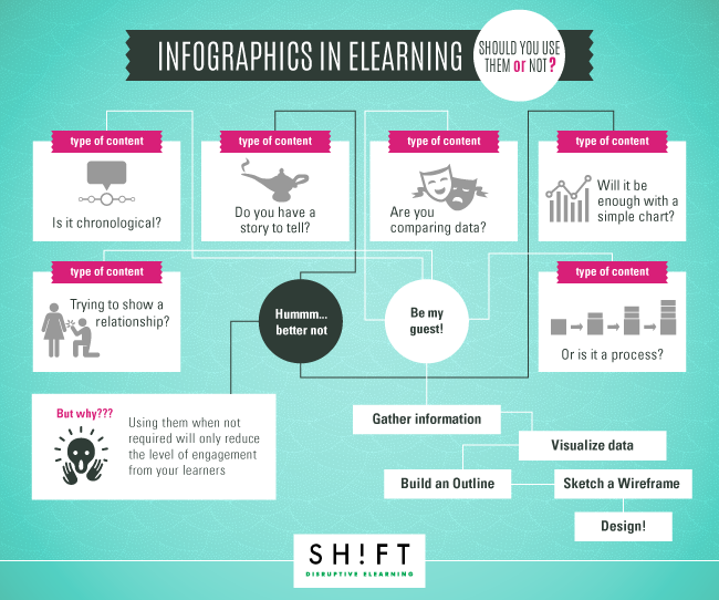
When Should You Use Infographics in eLearning
- When there is a chronological story to tell: This can include a biography of a person, growth of a business, or an evolutionary history of process/product.
- When you’re contrasting data. Comparing two processes, ideas, items, or people? Infographics are the best way for summarizing the thoughts.
- When you are connecting concepts. When showing relationships between events, categories, ideas, and time.
- When you want to explain a process. Technical subject matter can easily be explained with symbols, icons, and shapes.
When NOT to Use Infographics in eLearning
Beware of overkill. Using them when not required will only reduce the level of engagement from your readers. As a rule of thumb, avoid using infographics when:- When you have to tell a simple narrative. If simply have to tell a story, get on with it. If told correctly (a proper beginning, middle, and end) it will still be appreciated.
- When a simpler graphic will suffice. If your idea can be communicated using simple shapes and graphics, avoid an infographic.
- Because you think it would be cool. Infographics costs time and money. You want to make the most cost-effective eLearning experience — one that leverages visuals to boost engagement and not to incur costs. It may be tempting, but stay put.
Creating an Infographic: Your 5–Step Guide
Let’s get straight to business. The five steps are:
- Information Gathering
- Visualize data
- Outline
- Wireframe
- Design and refine
1) Information Gathering
Schedule a meeting with your SME and stakeholders. Task yourself with collecting as much information and data as possible. You will most likely end up with a plethora of materials — ranging from PDFs, Presentations, Word files, Excel sheets, images, audio interviews, and notes.
You will need to mine, shred, and polish this material to create concise and meaningful chunks of data — and decide which content is relevant or should be used/converted into an infographic.
Sift through the data so that you have the most compelling stats, data, and visuals.
Once you’ve gathered the most relevant content to work with, describe your infographic in a single sentence. This sentence is your Infographic’s theme.
Stick to one sentence as a RULE OF THUMB. It will limit the amount of information your Infographic will communicate and prevent overload of information (and cognitive effort for the learner).
2) Visualize data
Well-designed infographics do more than dump content into a visual form. Your Infographic must tell a story, where one fact, or data point is connected to the next. This is why you should have a very strong theme (see previous section!).
Visualizing how your data will flow is crucial. All the remaining steps will simply polish it.
The best way is to write a story for your infograph. To do this, you must profile your learner: let’s say an adult (age 30+), a professional at an IT firm, working as a manager, looking for a course on handling disruptive IT technologies (cloud computing), etc.
Tell the story how YOU expect your learner to read through the Infographic. This will give you an idea of which data should come first and which next. It will also show you the best way to display your information (orientation, flow, and placement) and how to display that information (diagram, graphs, charts, icons, etc.).
Once you have a visualization story, you can simply replace sentences with visuals and data sets:
- Map (location, schematic, spatial)
- Graph (quantitative data, comparison, relationship between quantities)
- Diagram (icon, sequence, process, timelines)
- Chart (flow, organizational, schematic)
3) Build an Outline
Develop an idea hierarchy. Start with the most compelling data, one that is bound to glue the learner to the Infographic. You might already have an idea of this data (or lack thereof) from the visualization story created in the previous section.
An outline is not a sketch of the infograph, it still is written material. Like rough notes being organized to give a better picture of how the dots (ideas) will connect. Your outline should tell you:
- The major chunks of the Infographics (headings and sub sections)
- The relationship between elements (strike out ones that don’t make sense NO MATTER how good they look)
- Shows you which content you are prioritizing (It should be giving more emphasis on the important elements.)
4) Sketch a Wireframe
Once the data has been analyzed, the most relevant content has been picked, and you’ve determined a hierarchy, you need to draw or sketch a wireframe or flowchart.
Label the elements (sections and visuals) and sketch a rough wireframe. Wireframing is like creating a storyboard for an animation or like putting slides from a slide show one after the other.
5) Design and refine!
It’s time to use some digital tools to add color, contrast, and typography to the wireframe. The best option would be to pledge yourself to vector graphics. In case you aren’t a graphic designer, here are some interesting, easy to learn, online software.
If you are, then stick to your original idea and tinker with your creative hat on!