As a learner, did you ever face a situation when you felt that a course had nothing new to offer and the same information was presented in an obvious manner like every other time you have taken an eLearning?
That was a common situation for me as well... as an eLearning designer. Every time I sat to design a course or training material, I was stuck with the same old style guide that the client has provided me and do not get enough scope to experiment. One fine day I decided to take a plunge and move forward.
Visual design can affect a host of things in learning. It especially helps to concretize the learning for a more clear and memorable experience. Therefore, we, eLearning designers, must carefully observe current trends that will keep our courses from feeling lifeless.
And believe it or not, 2015 is believed to be the year when these visual trends will be seen looming large over the industry and bringing about a change (for better) in the way eLearning is perceived across the globe.
Let us now take a look at how these trends would impact your eLearning designs:
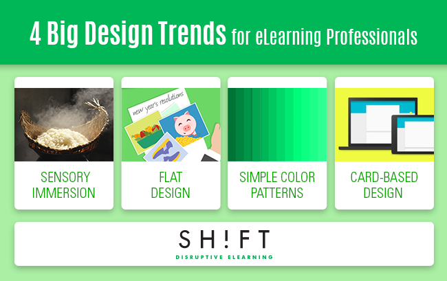
#1: Super sensory images
Sensory immersion in photographs is trending in the year 2015. For those who aren’t aware, this includes bringing pixels in a way that you can almost touch, smell, and taste the photograph virtually on the screen.
Pam Grossman, the Director of Visual Trends at Getty images claimed that the sensory immersion is more about the content than composition because we as learners or audience are consistently looking for imagery that can appeal to all our senses.
The best part about the sensory immersion is the intimate engagement. Recently in a course, I used an image which depicted the aroma of the flavourful dish that may appeal to the sense of smell of the learners while reading the topic.
Often when you visit a restaurant or a coffee shop, it is the vibrant imagery that often compels us to try a new flavour or aroma. And it is the super sensory images displayed all around, like the spiraling rich white smoke from a steaming hot cup of coffee or some exotic cheese oozing from a slice of pizza decked with vibrantly colored veggies that does the trick.
Takeaway: Use super sensory images in your courses, to make learners feel "like they can physically feel what is displayed in the image ".
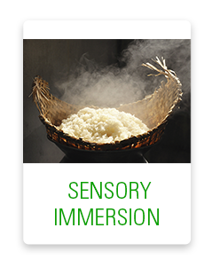
# 2: Flat Design
 We as eLearning professionals always want to design something which always remains fresh and unique. And for this, I always prefer to go for a flat design, which is again making a huge comeback in 2015. It draws its inspiration from different popular art styles including the likes of Swiss style and Bauhaus style. But it was the release of IOS 7 that made flat design so much popular.
Flat design is visually appealing for the fact that it rids the design from any three-dimensional features like shadows, bevels, and gradients. It focuses on typography and presenting content in a simple and clear way. It helps designers showcases the bare minimum of elements in the course.
Takeaway: This doens't mean you should completely give up shadows or textures, but opting for this minimalistic, simple design form your courses can look lean and clutter-free. Using flat shapes can help your learners have a more accessible experience. Besides, because of the new emphasis on mobile, eLearning is expected to be much more minimalist than in previous years.
Grab these: 20+ Best Flat Icon Sets for Web Designers January 2015
Read:
- A Look at Flat Design and Why It's Significant
- 16 Perfect Examples Of Flat Web Design
- Creating Flat Design Images from PowerPoint's Clip Art
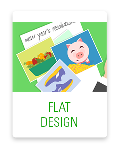
# 3: Simple Color Patterns
 The primary characteristic of simple color patterns is ‘monochromatic color schemes’. This scheme uses tints and shades of no more than one or two colors and it emphasizes the need to use various shades of a single hue to enhance the aesthetic appeal, which has been much in vogue in 2014 and is more likely to trend in 2015.
The striking part about using monochromatic colors is that it is all about unity and simplicity. The focal point is why you should overdo your course with multiple colors when a single color can make it look even more uniform and interesting.
Takeaway: When designing your eLearning courses, try to make the most creative use of a limited color palette. This will make a strong visual impact as well as influence the learner's psychology to a great extent.
Create your own monochromatic color palette here.
#4: Card-based design
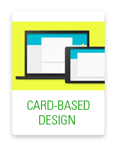 For mobile, cards are rapidly becoming the favorite design pattern. Web giants like Google, Twitter, Line, Facebook, etc. all rely heavily on the “card metaphor” for displaying content. Pinterest is completely built using the card approach.
In 2015, we are sure to see more of card-centric designs in almost everything – websites, eLearning courses, mobile learning, etc. To start with, the new ‘visual promotions tab’ of Google uses the card approach to bring about a vast improvement in marketing email. Several features of iOS7 are card-based as well. Take for example, the App Switcher and Airdrop.
The primary advantage of using cards is that they have been around since a long time and they do great while communicating quick stories and giving a snapshot of information.
Takeaway: Card-like content boxes can work perfectly for eLearning because they are highly functional and effective mechanisms for conveying rapid-fire content in concise bursts—allowing for people to get an immediate glance at your content (this fits perfectly with short attention spans and a lot of distractions learners face today).
Another advantage with cards is that they are easy to rearrange, hence they respond greatly to responsive design challenges. For instance, a desktop screen may have five to six card columns but a smartphone will have just one.
Take a look at this example.
Read:
Why Cards Are the Future of the Web

%MCEPASTEBIN%