It’s no secret that people do a great deal of learning through what they see. Because of this, eLearning professionals have the double duty of not only creating informative courses, but ones that are visually engaging with graphics that add to the learning process.
The good news is, with the variety of handy and often free or low cost tutorials, tips and tools to be found online, you don’t need to be a rocket scientist when it comes to design. In this article we’ll look at easy ways to use basic design skills in order to create new graphics or enhance existing ones. There’s no need to spend money on expensive graphics or give up control to a freelancer when you can create graphics on your own.

Here is our list of top design hacks along with links to get you creating better, easier and cooler graphics for your eLearning courses:
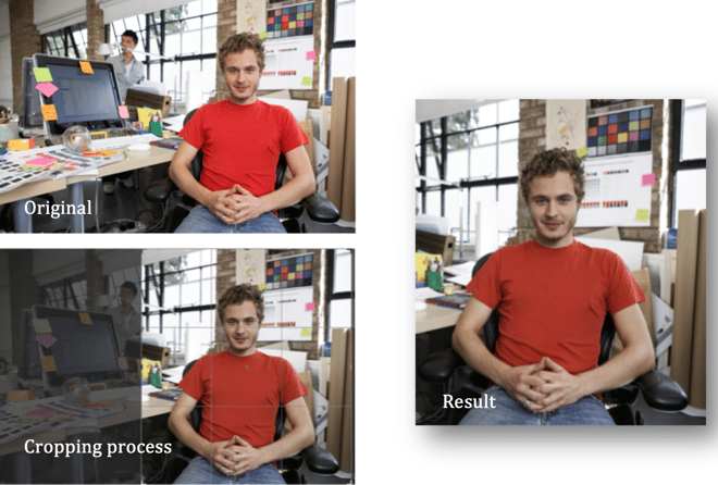
Tip #1: Crop Stock Photography
Stock photography can be a true time saver, but most images are often a little, well, cliché and generic. This can certainly make your course look unnatural and cheese. However, by cropping images you can reduce the amount of awkward negative space or focus on key elements while leaving out others. No, cropping won’t make you look like an up and coming Annie Leibovitz, but it can do wonders for making an image fit in with a theme versus distracting learners from the course.
Example:
Resources to check out:
- Programs like Photoshop, GIMP, and Pixlr can help you crop photos easily.
- Also, you can sign up for Cropp.me (there's a free version).
- Visit Study.com for a step by step tutorial on PowerPoint Cropping.
Tip #2: Reproduce Simple Charts and Graphs
Simple charts and graphs can be a great way to reinforce information and get a point across quickly and visually, however, using pre-drawn excel charts can be, in a word, boring. By working with an existing graph you can use the basic elements that are there but add in a better background and/or additional shapes, icons and images like this example, which uses these elements of design to illustrate data creatively:

Image source: Visual.ly
This can take some extra work but it can really help to make your course look attractive versus looking as if you just slapped in the first cookie cutter graph you found. Remember, if it looks like you don’t care, your learners won’t care either.
Also, using PowerPoint, you can easily remove the background by clicking “No Fill” under the fill paint can icon. By redrawing your own graph you will generally have better control over colors and typography, allowing you to make important information pop when you want it to, like in this example where key figures are written in red:

Image source: TED Blog
For additional resources explaining how to make your charts and graphs visually engaging, check out these links:
- Your Graphs Look Like Crap: 9 Ways to Simplify and Sexify Data
- 10 Simple Tips To Make Your Excel Charts Sexier
- Seven Tools to Make Boring Data Beautiful
- 7 Little Tricks to Spruce Up an Ugly Excel Graph
- How to Make Great Charts for Infographics
Tip #3: Remove Background of Images
Too often a decent photo is utterly ruined by an intrusive, boring or inappropriate background. With Photoshop this is easy to eliminate, but for those of us who need graphics but aren’t strictly designers, Photoshop isn’t always accessible. Fortunately, PowerPoint does a pretty good job of removing backgrounds when using Office 2010 or later.
Admittedly, the image might not be as perfectly separated from its background, but you can do it well enough in most cases by setting a background to “transparent.” This is easiest to do when you are stuck with an image that has a pure white background, but can also be accomplished with a more complex one as well. You can also use this ultra-convenient and fabulously Clipping Magic Tool as well.
Example:

Then just add the image with the transparent background into your course:

These links further explain how to get rid of a pesky background:
- How to Remove the Background of an Image in PowerPoint
- 3 Easy Ways To Remove Backgrounds From Images Without Specialized Software
- Remove an image background in PowerPoint
- PowerPoint Color Transparency Tip
- Remove the Background of a Picture with Microsoft Word
Tip #4: Creating stand-out graphics in Power Point
With this trick, the idea isn’t to eliminate a background, but rather to make it recede so another object can come forward and be more prominent. This is called the “stand-out” technique.
The Artistic Effects option in PowerPoint allows you to use an image with multiple objects while still having only one of those objects stand-out. The examples below show how emphasis is brought to the selected object (we literally created this effect in less than 3 minutes, following this Youtube tutorial).

Other fading techniques you can learn:
- Creating stand-out graphics in PowerPoint
- The Image Fade Technique
- The PowerPoint Blur Trick
- How to blur the background of a picture in PowerPoint 2010
Tip #5: Make Your Own Whiteboard Videos
Whiteboard animation (animations that draw themselves), are an interesting way to add life to your eLearning. These videos often use voiceovers and sound along with images to create the video. Once upon a time a graphic designer would have been needed to create these, but thanks to several online tools you can now make your own with simple drag and drop methods. These videos will help you to demonstrate tutorials, concepts, step-by-step processes and more.
And let’s say you want to show users how to use your new app. What’s better, a wordy screen or an actual demonstration of how it’s done? With a whiteboard video you can back up or even replace your text explanation with a far more engaging and memorable video. These are our top picks for best online tools to create whiteboard videos:
Other Explanations and Tutorials:
Like with all of the tips mentioned here, none are exactly necessary to create your eLearning course but, they can make a huge difference in how effective your course is.